Mobile-First Web Development: Essential Best Practices for Responsive Design
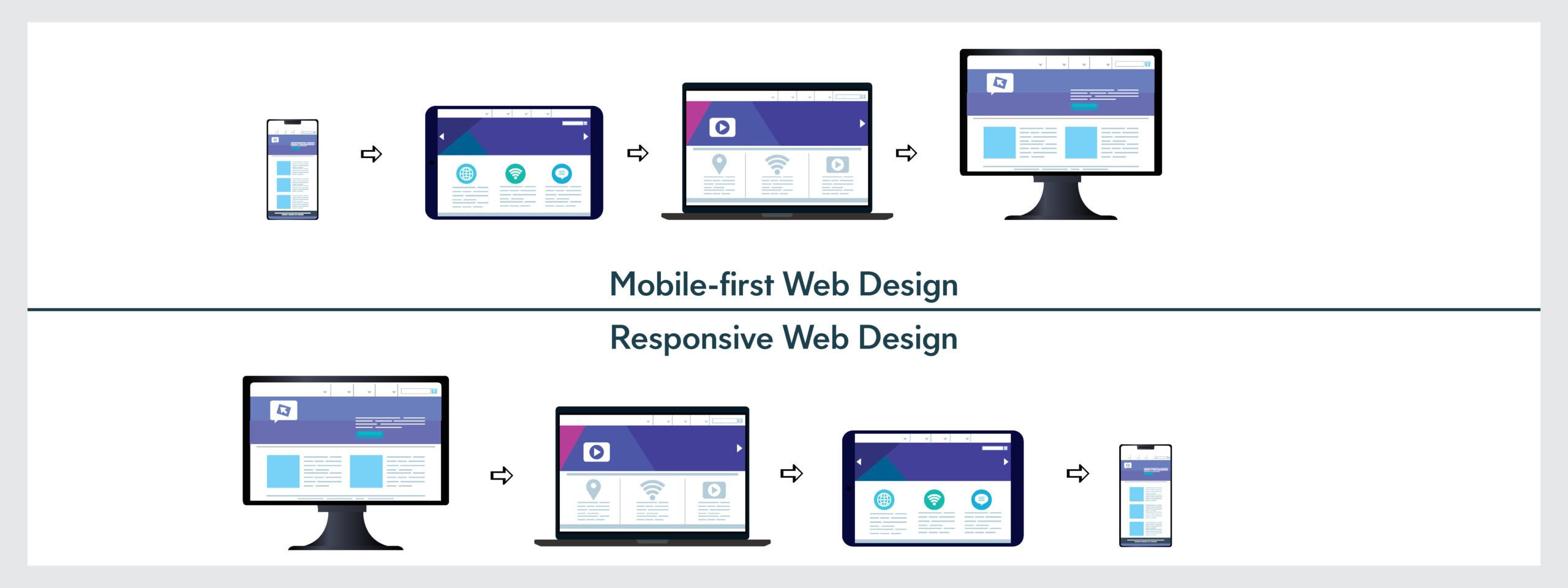
Understanding Mobile-First Web Development
Mobile-first web development has become the industry standard as mobile devices now account for over 60% of global web traffic. This approach prioritizes designing and developing websites for mobile devices first, then progressively enhancing the experience for larger screens. Unlike traditional desktop-first approaches, mobile-first development ensures that your website functions optimally on smartphones and tablets before considering desktop enhancements.
The shift toward mobile-first development reflects changing user behaviors and search engine algorithms. Google’s mobile-first indexing means search engines crawl and rank websites based on their mobile versions. Adopting mobile-first web development not only improves user experience but also boosts your SEO rankings significantly.
How to Make Website Responsive: Core Principles
Creating a responsive website requires a strategic approach that adapts seamlessly across all devices. The foundation begins with a flexible grid system that scales proportionally based on screen size. Using relative units like percentages and em values instead of fixed pixels allows your layout to adjust dynamically.
Implementing a mobile viewport meta tag is crucial for responsive design. This tag tells browsers how to control the page dimensions and scaling on different devices. Without it, mobile browsers render pages at desktop width, requiring users to zoom and scroll horizontally.
Media queries form another essential component of responsive design. These CSS rules allow you to apply different styles based on device characteristics like screen width, height, and orientation. By defining breakpoints at 480px, 768px, and 1024px, you can create tailored experiences for mobile phones, tablets, and desktops respectively.
Fluid typography ensures text remains readable across all screen sizes. Instead of fixed font sizes, use relative units that scale proportionally. This approach maintains visual hierarchy and readability without requiring excessive media queries for every font size adjustment.
Responsive vs Mobile Friendly Design: Key Differences
While these terms are sometimes used interchangeably, responsive and mobile friendly design represent different approaches. Mobile friendly design focuses on creating a functional experience for mobile users, often through separate mobile versions or simplified layouts. Responsive design, however, uses a single codebase that adapts to all devices automatically.
Responsive design offers several advantages over mobile-only approaches. It reduces development time and maintenance costs since you manage one website rather than multiple versions. Users experience consistent branding and functionality across devices, improving overall brand perception and user satisfaction.
Mobile friendly design might include features like touch-optimized buttons and simplified navigation menus. Responsive design encompasses these features while maintaining a cohesive experience across all screen sizes. Modern web standards strongly recommend responsive design as the superior approach for long-term sustainability and user engagement.
Search engines also favor responsive design. Google explicitly recommends responsive web design as the best practice for mobile optimization, meaning responsive websites typically rank higher in mobile search results than non-responsive alternatives.
CSS Grid and Flexbox for Mobile: Layout Solutions
CSS Flexbox provides an efficient one-dimensional layout system perfect for mobile development. Flexbox excels at distributing space along a single axis, making it ideal for navigation menus, button groups, and vertical stacking on mobile devices. Its alignment and justification properties simplify centering content, a common challenge in responsive design.
CSS Grid offers a two-dimensional layout system that handles complex arrangements across multiple rows and columns. For mobile devices, Grid adapts perfectly to linear single-column layouts. As screens expand, Grid allows you to redistribute items across multiple columns without changing HTML structure.
The combination of Flexbox and Grid creates powerful responsive layouts. Use Flexbox for component-level layouts like cards and button groups, while Grid manages page-level structure. This layered approach simplifies responsive logic and reduces media query dependencies.
Mobile-first implementation with these tools involves starting with simple Flexbox stacks, then progressively introducing Grid layouts at larger breakpoints. This technique ensures mobile functionality remains solid while desktop users enjoy sophisticated multi-column designs.
Best Practices for Mobile-First Implementation
Begin your mobile-first web development process by designing for the smallest screen first. This constraint forces prioritization of essential content and functionality, resulting in cleaner, faster-loading pages. Start with minimal CSS and progressively add features for larger screens using min-width media queries.
Optimize images aggressively for mobile users. Use responsive image formats with srcset attributes to serve appropriately sized images based on device capabilities. Modern formats like WebP reduce file sizes by 25-35% compared to traditional JPEGs, significantly improving mobile performance.
Touch targets must measure at least 48×48 pixels to accommodate finger tapping accurately. This spacing prevents accidental clicks and improves accessibility. Pay special attention to form inputs and navigation elements, ensuring they’re easily tappable on mobile devices.
Performance optimization is critical for mobile users who often have slower connections. Minimize CSS and JavaScript, lazy-load images, and implement caching strategies. Mobile-first development naturally encourages performance optimization since mobile constraints force efficiency-focused decisions.
Test extensively across actual devices and browsers. Emulators provide quick feedback, but real device testing reveals issues emulators miss. Include various screen sizes, orientations, and operating systems in your testing plan to ensure comprehensive compatibility.
Conclusion
Mobile-first web development represents the modern standard for creating responsive, user-centric websites. By prioritizing mobile experiences and leveraging CSS Grid and Flexbox, you create flexible layouts that serve all users effectively. Understanding the distinction between responsive and mobile friendly design helps you choose the right approach for your project. Implementing these best practices ensures your website performs excellently across devices, improves search rankings, and delivers superior user experiences. As mobile usage continues growing, adopting mobile-first development isn’t optional—it’s essential for online success.
Leave a Reply